Wondering which print is best when teaching children letter sounds? I have the answer!
Traditional print versus other prints…which one is best?

This post may contain affiliate links. I may earn compensation when you click on the links; at no additional cost to you. Please see the disclosure policy for more information.
It’s not as cut and dry as you thought…
When I first started my Montessori training, I was trained using traditional print. All of the language materials were in traditional print. This was about 19 years ago, and I believe that most companies that sold Montessori materials at that time pretty much only had the option of either traditional print for the Primary (preschool) and cursive for the Elementary. This was fine and dandy for many years, until new fonts and prints were slowly introduced and then incorporated into public schools and into main stream.
For most of my early years of teaching, I used the traditional print font for my language materials and was just fine using it. But I noticed early on in my teaching career, that many children had difficulty in distinguishing between the “b, p,and d. Depending on the manufacturer, the “q” sometimes was printed with a slight “tail” on the end, and sometimes it was not. They basically were the same letter, just positioned differently. Throughout the years, I learned that it became more common that children in my classes struggled with differentiating between those particular letters.
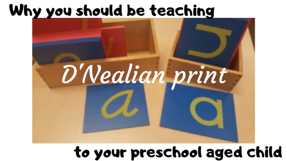
D’Nealian print…what is it and why choose it over traditional print?

I was introduced to D’Nealian print when my oldest daughter entered into the public school system for first grade. It was interesting at first; I wasn’t sure how I felt about it; especially since I was only accustomed to using traditional print. I quickly found out the reasoning for using D’Nealian…it was a precursor to cursive. It was still years later before I actually decided to take the chance and change from using traditional print and switch to using D’Nealian print.
The first time I used D’Nealian print exclusively in my classroom was a turning point for me as a teacher. At the time, I was working at a small school, and the classroom language materials were all in D’Nealian. The sandpaper letters, Moveable alphabet, and the print on all the other lesson cards were all D’Nealian. It was not in the school budget to reorder and replace the language materials, so I figured that there would be no better time than then to give D’Nealian a try. I absolutely LOVED it!!!! I noticed right away how easily the children confidently noticed the differences between the “b, p, d, and q”. They no longer struggled on deciphering between those letters; and yes, it truly does makes teaching cursive easier.
The big deal about cursive
You are probably wondering; why worry about teaching them to write in cursive? They will learn that in public school. Shockingly, public schools NO LONGER teach cursive!!! I found this out when my youngest daughter was in public school. When my oldest daughter was in pubic school, she learned how to write in cursive; they were still teaching it at the time. By the time my youngest daughter got to the point when she should have been taught how to write in cursive, they had stopped teaching it! I found this to be really weird…how are our children supposed to learn how to sign their name, which is important, if they are not taught how to write in cursive? Once I found that out, I took that as a sign to definitely start utilizing, introducing and incorporating the D’Nealian print style into all aspects of my classroom. Once I did, I never looked back!
My full switch from traditional print to D’Nealian was not an easy transition. It took reasoning, research and perseverance on my part to make the full switch to using D’Nealian. I had been trained a certain way, and did not want to go against my Montessori training, but I understood the underlying reasons for making the switch.
Over the years, I slowly incorporated using the D’Nealian print in all areas and aspect of my language materials. I would use the D’Nealian sandpaper letters to introduce sounds, and once the children had lessons on and mastered at least four to six sounds, I would take it to the next step. I used this font in different ways throughout the classroom and in other lessons, so that the children would get familiar with its look.

I even created Sound Boxes using D’Nealian print. These are introduced after the sand paper letters. Sound Boxes are a language material to help teach and master the letter sounds. I put them in groups of five; excluding the letter ‘x’. In Montessori, the letter ‘x’ sound is taught as an ending sound, not a beginning sound. There are two pictures for each beginning sound in each box; and the children are supposed to put the corresponding picture under the appropriate wooden letter sound.
I also had and used the D’Nealian Moveable Alphabet. This was the initial introduction of the forming and writing of the D’Nealian style letters. Using the D’Nealian print style for writing definitely made the transition into teaching cursive a fairly easy one; considering the D’Nealian letters already have a slight slant to them. It also made for an easier lesson since many D’Nealian letters have the “tail” that I was talking about earlier.

In conclusion
There are many benefits to teaching your preschool aged child to learn, use and write with D’Nealian print. I know that there are many other Montessori trained individuals that may not agree with my reasoning and findings; and that’s fine. That is the beauty of Montessori…it can be interpreted in different ways by different people; and each person’s interpretation is not wrong or right.
So as you can see, from my experience and the usage of both traditional print and D’Nealian print, I feel that D’Nealin is superior to traditional print; when it comes to the recognition of the letters and the ease of transitioning to cursive.
Agree? Disagree? Let me know what you think in the comments!
Anitra J.


Anitra I agree! My son goes to Montessori and they were teaching D’Nealian. At first I thought it was so strange because that isn’t how I learned and I don’t see many examples of it in teacher supply stores near us. He’s in first grade now and talks about learning cursive. He already has a cursive signature. This isn’t something they taught him, but I journal and prefer cursive so he is used to seeing it around our house. I see the value in learning the D’Nealian style now and agree that it is a much easier transition to cursive. Lovely blog!
I’m really interested in Montessori and teaching my daughter. This post was very informative I had no idea how important the type of font used is to teach children.
I had never heard of D’Nealian print before today. I have a son that I plan to begin homeschooling in the near future so this is a great resource for me! Thank you for sharing!
Stephanie
http://www.justasiamnow.com
I’ve used Handwriting Without Tears in our homeschool for the past 7 years and it has been a good fit for us. The print books are followed by cursive books, which I am insistent that my kids learn. I have heard of D’Nealian before and appreciate your insights about it!
Interesting. Now that we are working online, my first grader and I ran into a more “pre-cursive” font that he really liked. It looks much like this D’ Nealian print you are talking about. He said “hey it looks kind of like cursive!” It certainly has a more natural feel to it, like handwriting, I see the value! Great timing!
Hmm,.I’ve not heard of this before but it’s very interesting..thanks for the informative article.
I agree that D’Nealian is the way to go. I remember years ago when our school district moved to D’Nealian and I thought it was a good switch. Much easier transition to cursive. Thanks for sharing!
I never thought about this, but it makes total sense! I will definitely be switching to D-Nealian after reading this. I want my kids to know cursive too!
This was very interesting to read! I had never heard of D’Nealian print until reading this article. My daughter just finished grade one and it has never come up. I think it’s a great idea to help introduce cursive. Many young people won’t ever learn to write cursive and this could be a great start!
Fascinating! I just learned that the reason Instagram addded comic sans is because it’s easier for some people with learning disabilities / ADHD to read.